What I Learned Redesigning My Chocolate Database Webapp with AI
In summer 2020 I had a small Python web app around one of my favorite datasets: 300 chocolates that my hunsband and me had tried over the years with reviews and ratings and a machine learning model that predicts how much we may like an unknown chocolate.
Technically, it was a SQLite database with a search interface that was a simple keyword match.
It worked: It was also really ugly. Because I am not a frontend developer, I had happily used Streamlit. That was a good choice for getting something working quickly, but it also meant the interface looked like what it was: a table with some hacky filters on the side.
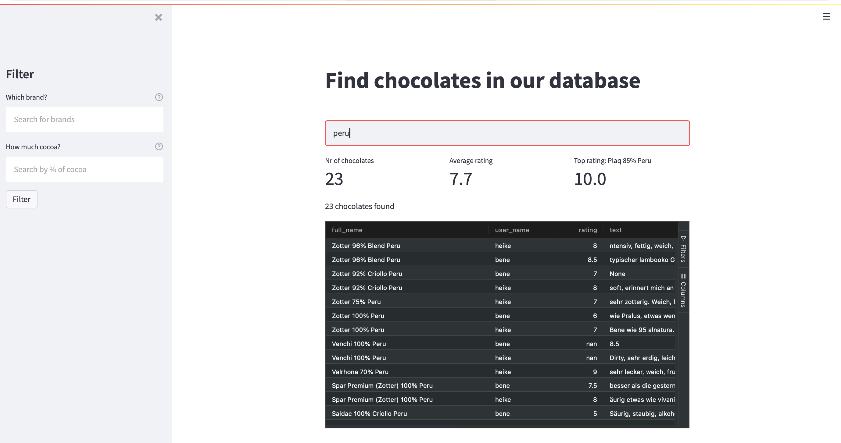
And yes, I am a little embarrassed to show this screenshot to you.
With the help of aider around 2023 and later Codex, the app had grown the usual side-project way: adding more features like more information about chocolates and an admin interface. However, the design was still terrible: emojis and lots of boxes.
I tried to fix it with AI design prompts. “Make this more modern.” “Improve the UX.” “Use better spacing.” I also tried design-focused coding assistants and design skills. It was still an inconsistent design with lot’s of boxes. In my chocolate search resultlist every field from the SQLite Table got it’s own box.
The useful shift came when I stopped asking AI to decorate the old interface and started using Google Stitch to rethink what the database was for.
The First Mistake: Asking AI To Redesign The Existing App
My first approach was obvious:
Here is my existing web app. Please redesign it.
This sounds sensible. It preserves the current app. It gives the AI real context. It should reduce hallucination.
In practice, it preserved too much.
The AI kept inheriting the old structure: mostlhy the same page hierarchy, the same mental model, the same “database table with decoration” feeling. The design was slightly better, because there were less boxes. But it was still overloaded and buggy.
I iterated on this for about a week. The pages got more consistent but they did not get good.
The important lesson was: if your current UI is the problem, giving it as the main source of truth can anchor the redesign to exactly the wrong thing.
The Better Approach: Describe The Dataset, Not The Implementation
The second approach was more useful:
Forget the existing app. Design a small chocolate discovery website around this dataset.
Instead of feeding Google Stitch my old UI, I described what the data contained and what I wanted a visitor to do:
- search chocolates
- browse a small database
- compare ratings
- inspect details, tasting notes, and metadata
- make the site feel more like discovery than administration
You do not even have to write this feature list yourself. A surprisingly useful step is to ask an AI:
Given this app and dataset, what are the core user journeys? What would make this useful and delightful?
Then review the answer critically.
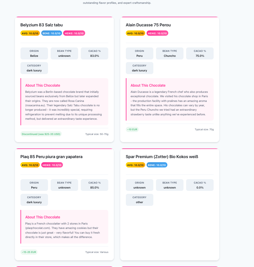
This produced a much better first draft. The design finally stopped looking like a web form around a CSV file. It became closer to a small data experience: more visual hierarchy, better emphasis on discovery, clearer entry points, and fewer meaningless containers.
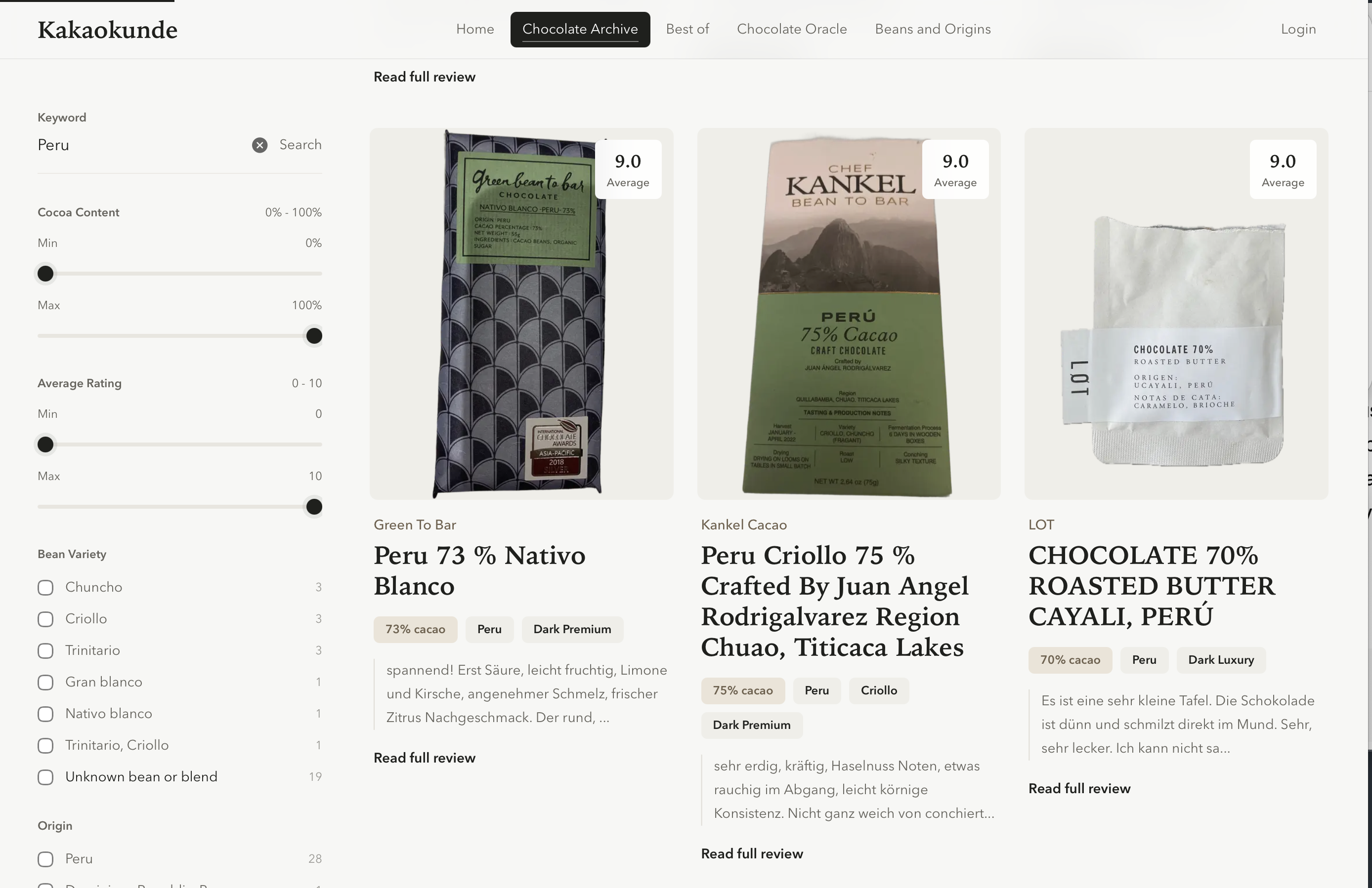
That first Stitch draft became the basis for the current website.
Playwright Became My Design Review Loop
The next problem was implementation.
AI-generated UI often looks good in the screenshot and then breaks in the browser. Text wraps badly. Cards become uneven. Mobile layouts collapse. Spacing changes when real data arrives.
So I used Playwright as a design review loop.
Not in a fancy way. I used it to open the page, take screenshots, compare desktop and mobile states, and catch the obvious regressions that I would otherwise miss while staring at code. This mattered because the goal was not “does the CSS compile?” The goal was “does this still look like the design I accepted?”
This is one of my biggest learnings from the project:
For AI-built frontends, screenshots are tests.
Unit tests will not tell you that your beautiful card grid now has one item with a three-line title pushing everything out of alignment. A browser check will.
Then I Threw Away The Backend Too
After the frontend redesign worked, I became less attached to the backend.
The old backend had accumulated along with the old UI. I decided to rebuild it from scratch as well, but with one important constraint: releases had to pass a small set of tests.
The stack stayed boring: Python, FastAPI, SQLAlchemy, Postgres, Docker. The AI wrote a lot of code I would not have written by hand as quickly. But I understood the contract:
- the database must initialize
- the app must start
- keyword search must return expected chocolates for known queries
- important pages must render
- detail pages must keep showing the right metadata and reviews
- smoke tests must pass before release
That distinction matters. I do not need to lovingly understand every line of framework glue. I do need to know what behavior must never break.
The Uncomfortable Part: You Can Use A Stack You Do Not Know
This project changed my opinion on using unfamiliar tech stacks.
Previously, I would have said: do not ship code you do not understand.
I still mostly believe that. But now I would phrase it differently:
Do not ship behavior you cannot verify.
There is a difference.
If AI chooses a framework or library I would not have chosen myself, that is not automatically a problem. If I cannot test whether database access, search, error handling, and page rendering still work, that is a problem.
AI lets you move faster into unfamiliar territory. Testing is what stops that from becoming random wandering.
The Main Lessons
1. Redesigning from the old UI can preserve the wrong assumptions
If the current app is ugly because the underlying mental model is wrong, do not start with screenshots of the current app. Start with the data and the user journeys.
2. Design tools are better at experience shape than coding agents are
Coding agents can improve CSS, but dedicated design tools like Stitch gave me much better first principles for layout, hierarchy, and visual direction.
3. Screenshots are part of the test suite now
For frontend work, Playwright is not only an end-to-end testing tool. It is a way to keep the visual loop honest.
4. AI-generated backend code is acceptable only when contracts are explicit
If you let AI rebuild backend code, define the tests first. The tests are your understanding made executable.
5. The best prompt is often not “improve this”
The better prompt is:
Here is the goal. Here are the users. Here are the core workflows. Ignore my current implementation if it gets in the way.
That shift made the biggest difference.
Conclusion
The surprising thing was not that AI could make my app prettier. I expected that.
The surprising thing was that the best result came from being willing to throw more away.
My old chocolate database app worked, but its structure kept pulling every redesign back toward the same boring interface. Once I described the dataset and the experience I wanted instead of the app I had, the AI became much more useful.
So my current rule is:
Use AI to explore the experience from scratch. Use tests to keep the implementation grounded.
That combination worked much better than asking AI to decorate old boxes.
An in case you’re curious how this website looks like today: Kakaokunde. The design and website is far from perfect.

