In summer 2020 I had a small Python web app around one of my favorite datasets: 300 chocolates that my hunsband and me had tried over the years with reviews and ratings and a machine learning model that predicts how much we may like an unknown chocolate.
Technically, it was a SQLite database with a search interface that was a simple keyword match.
It worked: It was also really ugly. Because I am not a frontend developer, I had happily used Streamlit. That was a good choice for getting something working quickly, but it also meant the interface looked like what it was: a table with some hacky filters on the side.
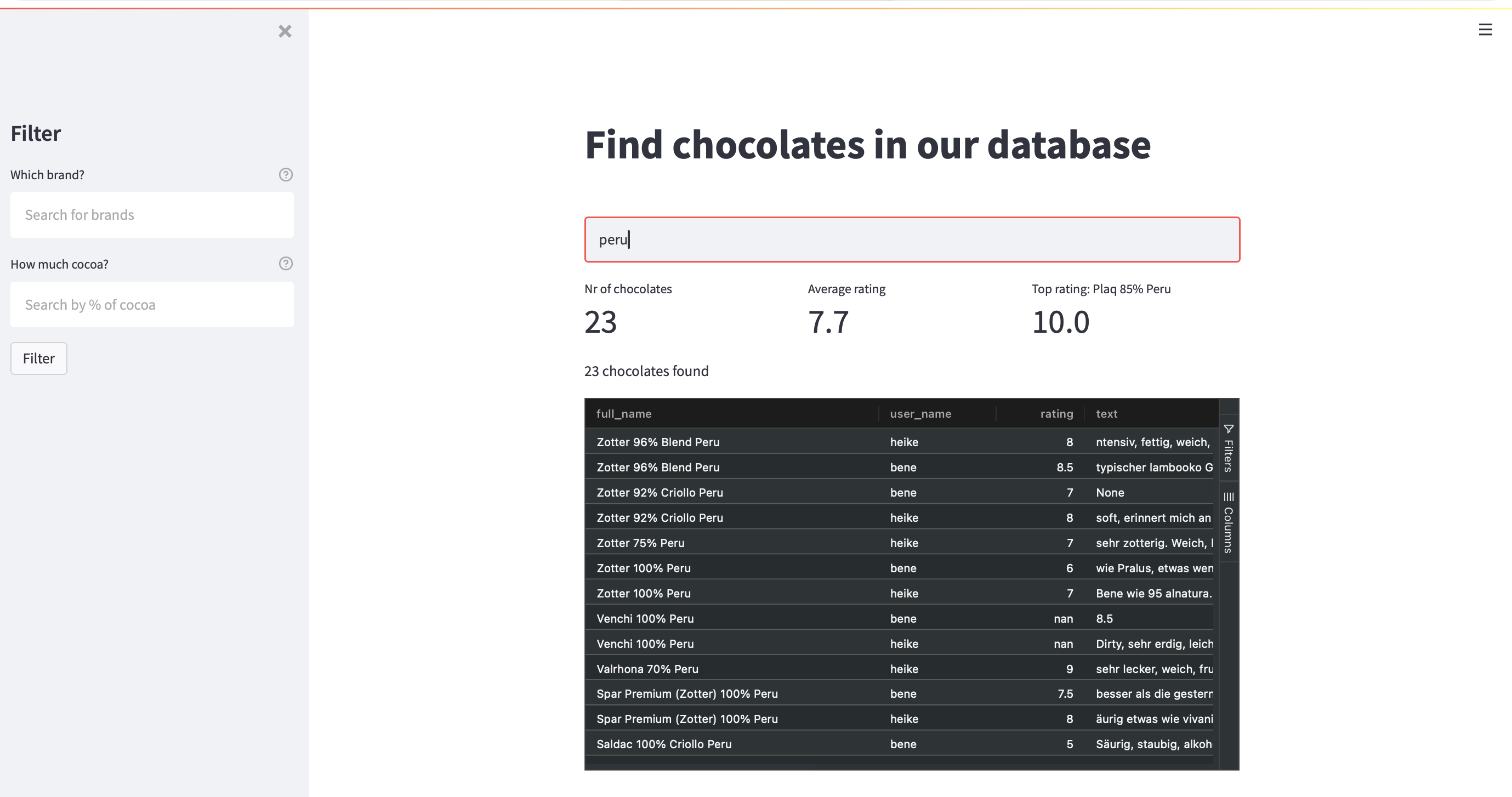
And yes, I am a little embarrassed to show this screenshot to you.
With the help of aider around 2023 and later Codex, the app had grown the usual side-project way: adding more features like more information about chocolates and an admin interface. However, the design was still terrible: emojis and lots of boxes.
I tried to fix it with AI design prompts. “Make this more modern.” “Improve the UX.” “Use better spacing.” I also tried design-focused coding assistants and design skills. It was still an inconsistent design with lot’s of boxes. In my chocolate search resultlist every field from the SQLite Table got it’s own box.
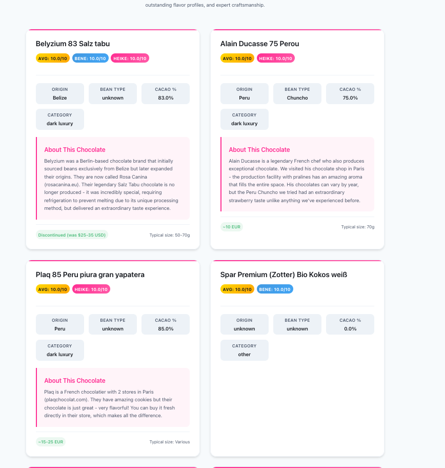
The useful shift came when I stopped asking AI to decorate the old interface and started using Google Stitch to rethink what the database was for.

