Seaborn is a python library for creating plots. It is based on matplotlib and provides a high-level interface for drawing statistical graphics.
Seaborn integrates nicely with pandas: It operates on DataFrames and arrays and does aggregations and semantic mapping automatically, which makes it a quick, convenient option for data visualization in your data projects. One you understand the basic concepts, you can create plots really easily without using stack overflow too much.
The basic steps for creating plots with seaborn are:
- Import libraries
- Prepare the data
- [optional] Control figure aesthetics (Grids, Color etc.)
- Create plot
- [optional] Further customization of your plot, which also can overwrite the figure aesthetics defined in step 2 (title, labels, tick marks etc.)
- Show or save the plot
Steps
Let’s walk through the steps of creating plots.
0 Import libraries
As mentioned above, searborn is built on top of matplotlib, but does not provide the full functionality. Therefore, we should always import both, matplotlib (with the pyplot module) and seaborn. It is likely that you will need matplotlib at some point (for example for changing the plot title or the tick labels and to show the plots).
import matplotlib.pyplot as plt
import seaborn as sns

%matplotlib inline # make sure plots are shown in a jupyter notebook. otherwise you will need plt.show()
1. Prepare Data
You can work with a pandas DataFrame. In general, you do not have to pre-aggregate your data. For example for count plots, seaborn will automatically calculate the counts for the count plot.
2. Figure Aesthetics
This is an optional step. You can just go with the default configuration here, or you can define aesthetics such as grid, axis, tick marks, color and font sizes.
Axis and Grid Style: per default, you will have a dark grid. You can change between grids (darkgrid, whitegrid), no grids (dark, white) and ticks (ticks).
sns.set_style("white")
remove the top and right axis with
sns.despine()
Color: Choose a color palette and set it as the default.
sns.set_palette(palette="rocket", n_colors=3)
Scaling: You can choose between four contexts notebook (default), paper, talk, and poster which scales font and lines according to the use case. But you can also override some.
sns.set_context("notebook", font_scale=1.5, rc={"lines.linewidth": 2.5})
Or set multiple parameters in one step with set() e.g. sns.set(context='notebook', style='white', font='Helvetica', font_scale=1, color_codes=True, rc=None))
3. Plot
In this step, you define what kind of plot you would like. There are two important distinctions you need to understand: figure and axes
A Figure refers to the whole figure that you see. A figure may consist of a single plot, but it is possible to have multiple subplots in the same figure. A specific sub-plot is called an Axes. There are functions that have an effect on the entire figure (figure-level functions) and some functions have an effect just on the specified subplot (axes-level-function).
For each type of plot (distributions, categorical, relational), there is a figure-level function, which takes the kind of plot as a parameter. For example, displot() is the figure-level function for plotting distributions. By passing the parameter kind="hist", it draws a histogram.
sns.displot(data, x, kind = "hist")
Alternatively, you can choose the axes-level function histplot() to plot a histogram.
sns.histplot(data, x)
The table gives an overview of the figure-level functions and their axes-level functions.
| type of plot | figure-level function | axes-level functions |
|---|---|---|
| distributions | displot |
e.g. histplot, rugplot |
| categorical | catplot |
e.g. barplot, boxplot |
| relational | relplot |
e.g. scatterplot, lineplot |
You can use both, figure-level and axes level functions for creating a single plot figure.
4. Customize
For customization, you will use some functions from
matplotlib.pyplot. Some often used customizations are adding labels to the axis (plt.xlabel and plt.ylabel) or determining the start and end of an axis (plt.ylim(0,100),plt.xlim(0,10))
plt.title("A Title") # add a plot title
plt.ylabel("Survived") # add a y-axis label
plt.xlabel("Sex") # add an x-axis label
plt.ylim(0,100) # start and end of y-axis
plt.xlim(0,10) # start and end of x-axis
5. Save or Show
If you use %matplotlib inline in your jupyter notebook, you will not need to call any functions for your plot to show up in the notebook. Otherwise, you will have to use plt.show() to show a plot and plt.savefig("foo.png") to save your figure.
plt.show()
plt.savefig("foo.png")
Examples: One Plot per figure
Let’s look at some examples for plots that are useful for understanding features of your dataset. First, we’ll tackle descriptives (count plots and distributions) and then relationships between features. We’ll use the built-in titanic dataset:
# (0) import packages and datasets
import matplotlib.pyplot as plt
import seaborn as sns
%matplotlib inline

titanic = sns.load_dataset('titanic')

#(2) Figure aesthetics
sns.set(context='notebook', style='white', palette='rocket', font='Helvetica', font_scale=1, color_codes=True)

titanic.head(5)
| survived | pclass | sex | age | sibsp | parch | fare | embarked | class | who | adult_male | deck | embark_town | alive | alone | |
|---|---|---|---|---|---|---|---|---|---|---|---|---|---|---|---|
| 0 | 0 | 3 | male | 22 | 1 | 0 | 7.25 | S | Third | man | True | nan | Southampton | no | False |
| 1 | 1 | 1 | female | 38 | 1 | 0 | 71.2833 | C | First | woman | False | C | Cherbourg | yes | False |
| 2 | 1 | 3 | female | 26 | 0 | 0 | 7.925 | S | Third | woman | False | nan | Southampton | yes | True |
| 3 | 1 | 1 | female | 35 | 1 | 0 | 53.1 | S | First | woman | False | C | Southampton | yes | False |
| 4 | 0 | 3 | male | 35 | 0 | 0 | 8.05 | S | Third | man | True | nan | Southampton | no | True |
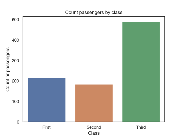
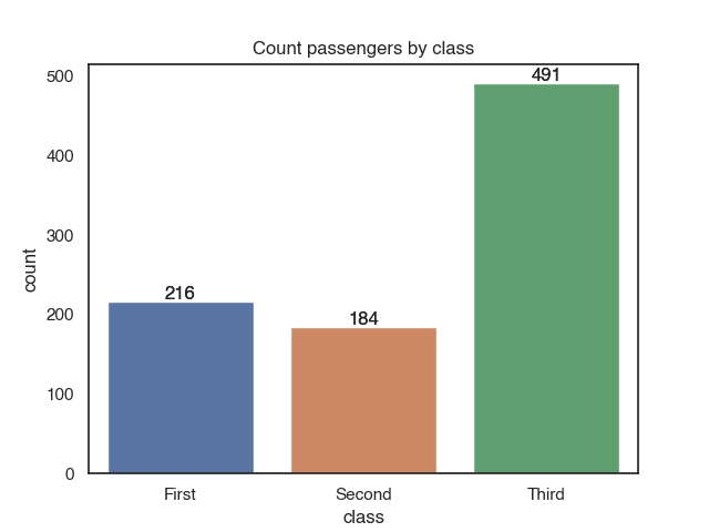
Plot distribution of categorical features with a countplot
Count plots automatically count the number of occurrences of each categorical feature value and displays them in a bar plot. You can just pass the dataset and the variable you want to plot as parameters. So no need to aggregate the data up front.
sns.countplot(x = 'class', data = titanic)

plt.title("Count passengers by class")
plt.xlabel("Class")
plt.ylabel("Count nr passengers")
You can annotate the bars with the counts with plt.annotate. It takes as arguments a text (the counts, which equals the height of the bar), xy (coordinates for the annotation) and data. We loop over each bar (plt.patches) in the plot and add the annotation:
c = sns.countplot(x = 'class', data = titanic)

for p in c.patches:
    c.annotate(p.get_height(),
                (p.get_x() + p.get_width() / 2.0,
                 p.get_height()),
                 ha = 'center',
                 va = 'center',
                 xytext = (0, 5),
                 textcoords = 'offset points')
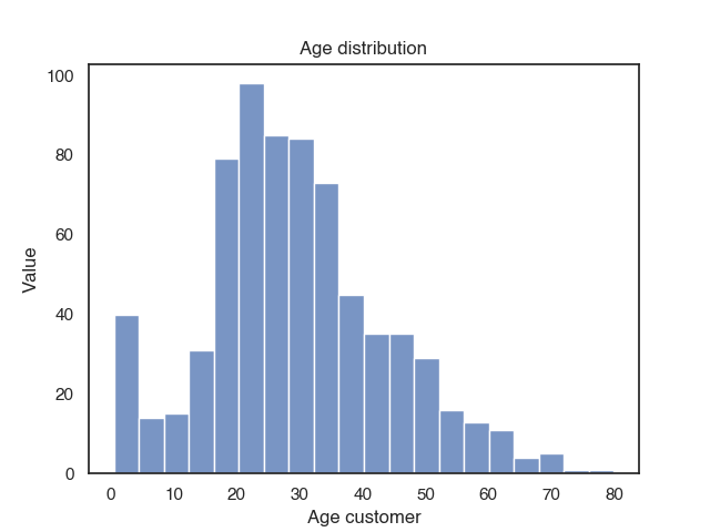
Plot distribution of numeric features in a histogram
Plotting the distribution of one feature is simple: You can use histplot() and pass the dataset and the feature you want to plot as a parameter.
sns.histplot(data=titanic, x="age")
plt.title("Age distribution")
plt.xlabel("Age customer")
plt.ylabel("Value")
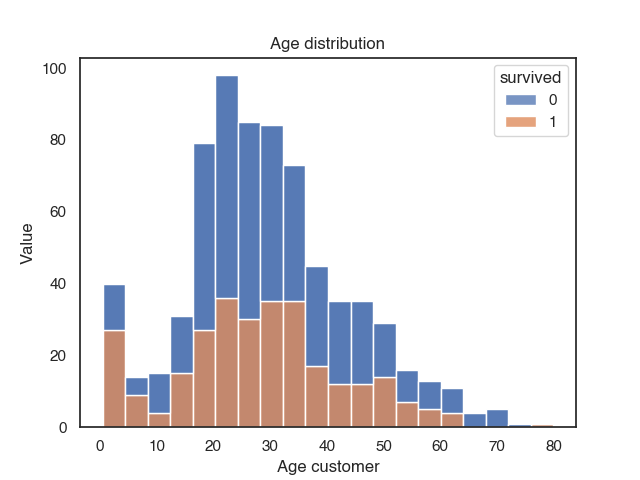
You can also plot the distributions and compare across multiple groups with hue.
sns.histplot(data=titanic, x="age", hue="survived", multiple="stack")
plt.title("Age distribution")
plt.xlabel("Age customer")
plt.ylabel("Value")
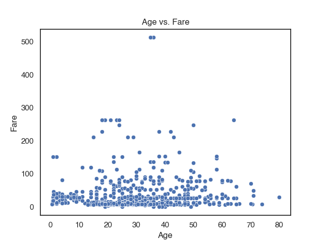
Plot relationships between features with a scatterplot
You can create a simple scatter plot with 2 variables like this:
sns.scatterplot(data = titanic,
               x = 'age',
               y = 'fare')
plt.title("Age vs. Fare")
plt.xlabel("Age")
plt.ylabel("Fare")
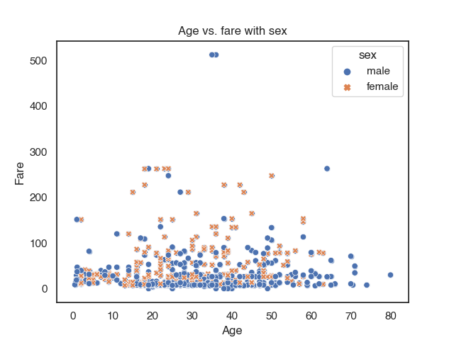
You can compare more than 2 variables with multiple groups using the parameters hue and style. Each will add a new group. If you specify hue and style for the same group it makes them more distinguishable.
sns.scatterplot(data = titanic,
               x = 'age',
               y = 'fare',
               hue = 'sex',
               style = 'sex')
plt.title("Age vs. fare with sex")
plt.xlabel("Age")
plt.ylabel("Fare")
Multiple Plots in one figure
If you want multiple, maybe even different types of plots in one figure, you can use subplots() from the matplotlib.pyplot library. plt.subplots(nrows, ncols) creates a single figure instance, with nrows * ncols axes instances and returns the created figure and axes instances. The grid of the axes is returned as an nrows * ncols shaped numpy array. If we passed for example the parameter nrows=2 ncols=2, we create a subplot with 2 rows and 2 columns. With the ax parameter in the axes-level functions, we specify the position of the plot. Let’s assume, we wanted to plot 2 plots side by side, we have to create a git with 1 row and 2 columns and put the plots at the correct positions.
# instanciate figure and axes instances
fig,axes = plt.subplots(1,2)

# first plot
sns.histplot(data=titanic, x="age", hue="survived", multiple="stack",ax=axes[0]) #first position
plt.xlabel("Age")
plt.ylabel("Counts")

# second plot
sns.scatterplot(data = titanic,
               x = 'age',
               y = 'fare',
               hue = 'survived',
               style = 'survived',ax=axes[1]) #second position
plt.xlabel("Age")
plt.ylabel("Fare")
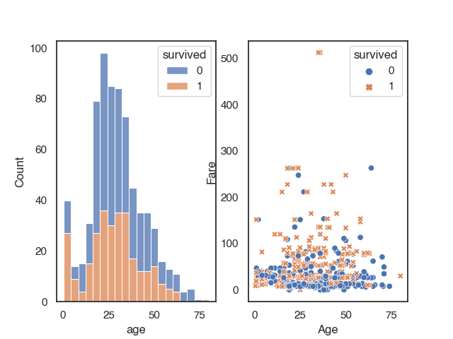
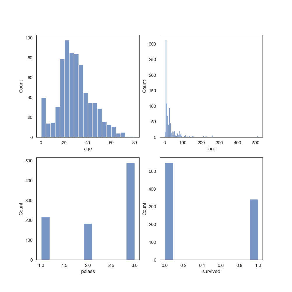
You can plot as many axes as you want into one figure. You can pass the position of the plot as ax = 'axes[row, column]. If you add more plots, you may need to increase the size of the figure so the plots are still readable
fig,axes = plt.subplots(2,2)

# increase figure size
fig.set_figheight(10)
fig.set_figwidth(10)

sns.histplot(data=titanic, x="age", ax=axes[0,0])
sns.histplot(data=titanic, x="fare", ax=axes[0,1])
sns.histplot(data=titanic, x="pclass", ax=axes[1,0])
sns.histplot(data=titanic, x="survived", ax=axes[1,1])
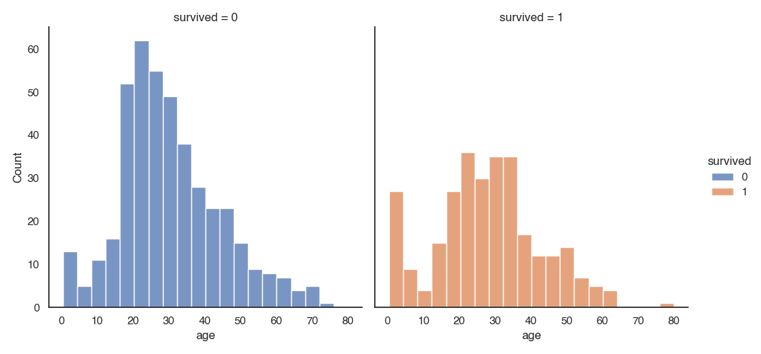
Facetgrids
The figure-level functions relplot, catplot() and displot are built on a FacetGrid. This means that it is easy to add faceting variables to visualize higher-dimensional relationships:
sns.displot(data=titanic, x="age", hue="survived", col="survived")
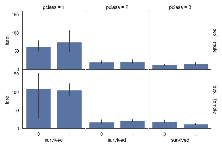
The FacetGrid class is useful when you want to visualize the distribution of a feature or the relationship between multiple features separately within subsets of your dataset. You may use three parameters to specify the dimensions row, col, and hue. row and col correspond to the array of axes. You can use hue to differentiate between different levels as you did in the scatter plot examples above.
with sns.axes_style("white"):
    g = sns.FacetGrid(titanic, row="sex", col="pclass", margin_titles=True, height=2.5)
g.map(sns.barplot, "survived", "fare")
g.fig.subplots_adjust(wspace=.02, hspace=.02)
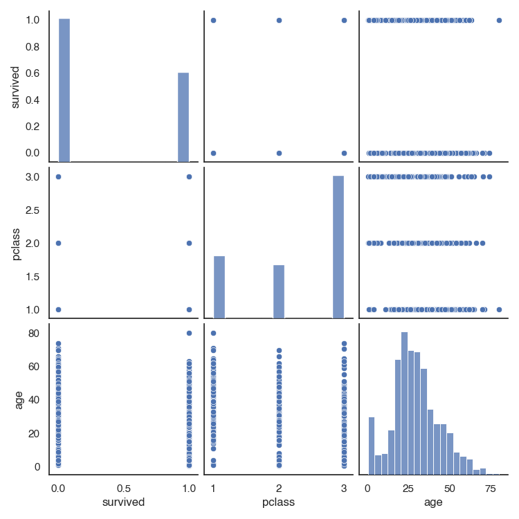
Quickly explore numerical features with a pairplot
One quick and easy way to start exploring a dataset is with sns.pairplot(). It automatically draws a scatter plot for the correlations between all numeric variables. The diagonal shows the distribution of each numeric feature.
For example for the first 4 columns in the titanic dataset, we will get a 3 x 3 grid, because there are 3 numeric variables in the dataset in the first 4 columns.
sns.pairplot(titanic.iloc[:,:4])